Bringing together the world’s top operators with an elegant, people-focused brand

  • Operators Guild
  • San Francisco, USA
  • 2023
  • Brand Narrative Workshop
  • Visual Branding
  • Brandbook
  • Illustration
  • Motion UI

The project

Positioned in an industry with various competitors who claim to offer the same perks, OG needed a fresh new brand identity to make them stand out as the best of the best

There’s no playbook when it comes to being an Operator–in other words, a CEO, COO, CFO, Strategist, Biz Ops, or Rev Ops. The only people who really understand these versatile, complex roles are operators themselves. That’s why Operators Guild (OG) was created: to build a community of world-class professionals who support and advise each other as they go along their career journey

The challenge

How can we make Operators Guild stand out as the highest-caliber community for operators, while making their values shine?

OG’s greatest “selling point” is their membership–they’re an organization that prides themselves on selecting only the best, most experienced, most highly-recommended professionals to join the group. But not only that–Founders Casey Woo and Jamie Seglarz personally interview every potential member to ensure that they’re aligned with OG’s values of generosity, sincerity, confidentiality, and zero ego.

Our challenge was to build a brand that showcased the caliber of members and high level of professionalism in the group, while appearing warm and approachable to potential members. We also wanted OG’s values to take center stage, both through the content and visual elements.

The solution

Creating a brand identity as sophisticated as it is cool, with elements to showcase community, connection, and constant growth

1. Brand Narrative Workshop

Our classic starting point for big projects, we ran a Brand Narrative Workshop to get a better sense of OG’s personality before beginning the branding process. This is how we came to define OG as a classy, authoritative, and professional brand that still has an edge of rebelliousness, due to its honest, no-nonsense nature.

2. Moodboards & Brand Rounds

After creating two moodboards (collections of visual references) to define OG’s overall aesthetic, we started to nail down colors, typographies, photography styles, and compositions for the brand. In the end, we went with a modernized version of the logo, a unique, subtle color palette with a bold orange accent color, combined serif and sans serif fonts for dynamism, and photos with a warm overlay to add a human element. All these aspects came together to form a brand that combined elegance and boldness.

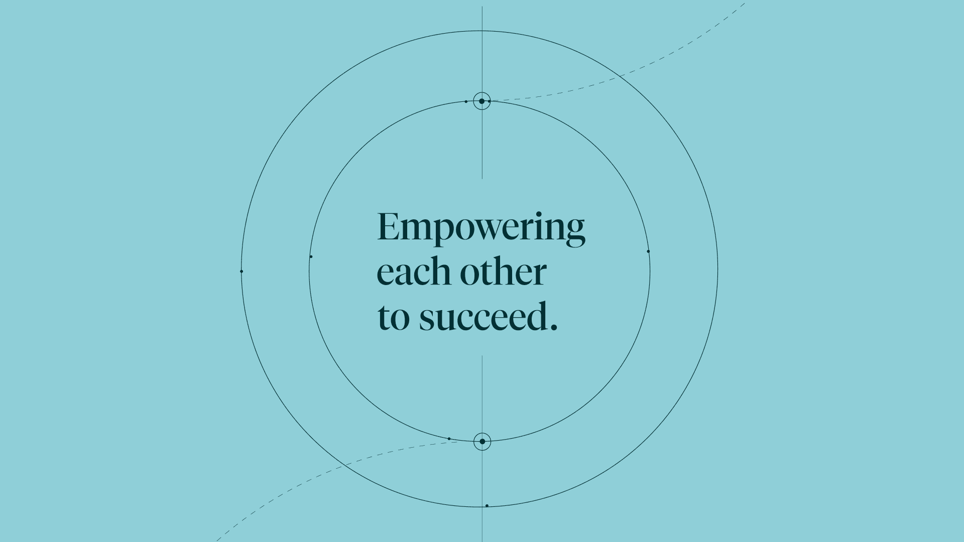
3. lllustration & Motion

Illustrations made with animation in mind brought OG’s brand identity together. The illustrations are line-based, with interlacing circles that represent communities and arrows that grow upward to symbolize constant learning and improvement. The goal was to portray the concept of community connection and growing together using these illustrations.

Indicius

The results

A brand that establishes Operators Guild as the place where the world’s top professionals come together

After making all these definitions alongside OG, we supplied them with a Brandbook that laid out the logo, color palette, typographies, photography, animations, and illustrations along with instructions on how to use them. It also included some mockups of how the brand would look in the wild. With their new branding, OG has the tools to make their identity shine through, attracting just the members they’re looking for.

Do you need to revamp the UX/UI of an already popular App, and really stand out?

We have the strategy, tools, and team spirit to make it happen.

Let's talk

Visit next case study

Bringing Paraguay’s first 100% digital bank to life


KapitalAsunción, Paraguay2021
Brand Narrative WorkshopVisual BrandingDesign Sprint